
With that said, my friend and fellow thriller author, John Betcher, is on a mission to revamp his book covers. He asked me to help him brand his James Becker book series. I agreed, and came up with a few possibilities for book one.
As always, I like to get input from all my writerly and readerly peeps. So I'd appreciate hearing what you think...and so would John.
Here's the deal....John is going to give away a copy of his award winning book, The 19th Element to a lucky winner who votes and leaves their contact information (email or twitter handle). I will announce the winner 48 hours after this post goes live, in the comment section below.
So what do you think?
Which book cover for The19th Element appeals to you the most?
This is a thriller series so keep that in mind when you cast your opinion.
 |
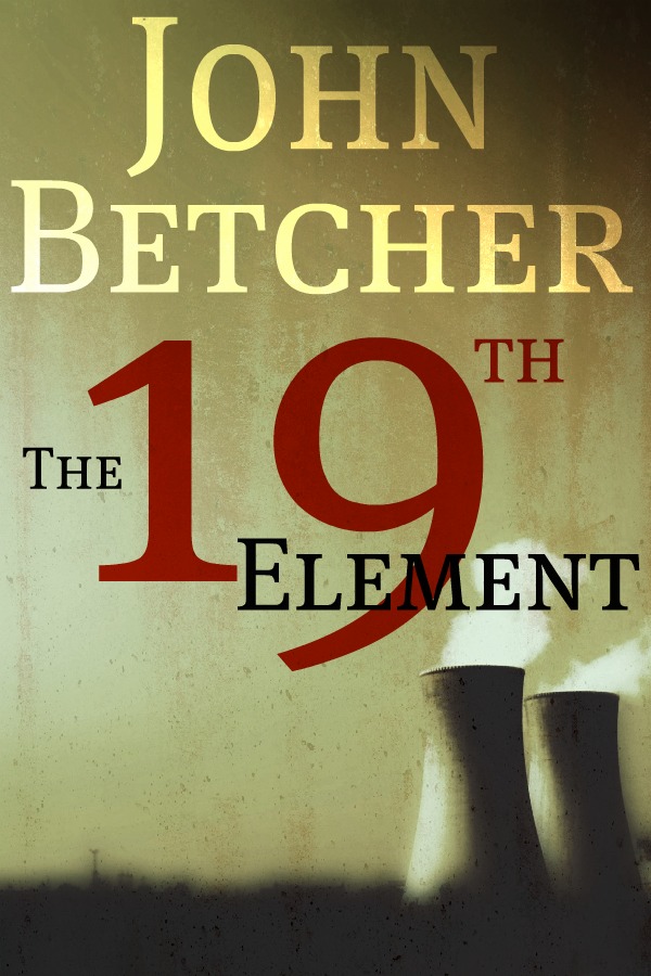
| #4 |
 |
| #1 |
 |
| #2 |
 |
| #3 |
 |
| #5 |
 |
| #6 |
So what's it going to be? Which cover draws you in?
Don't forget to leave your contact information.
You can see my other book covers in my $99 Book Cover page.
Thanks for stopping by. Join by email, and comment often.
Welcome to the indie revolution. BOOM!
I'm going to say number 6. I like the positioning and the "L" in the author name seems to add something.
ReplyDeleteGood blog, by the way. I'm following. neilvogler (at) gmail (dot) com.
You need to use the color of John's name from #2 inside #6.
ReplyDeleteBy the way ... how many elements are there ... 75 or 19?
Just askin' ... c",)
g@GerarddeMarigny.com
I like #2 the best
ReplyDeletetwitter: @jkcoi
#6. Love the rustic feel, gives it a grittier realistic impression. Think I'd like John's name from #2 in #6 though too! Awesome cover.
ReplyDeleteTwitter:@shawnahopkins
I like #6. Nuclear towers and the color of apocalyptic heat just go together, but I agree with @shawnahopkins that the font from #2 would be great on cover #6.
ReplyDelete@topabbott
Number Six is one that I would pick up if I were browsing in a bookstore
ReplyDeleteSorry, twitter is @ruthmadison82
ReplyDeleteAlso I just realized that number six is the only one that has text about it being book one in a series and I really like that!
Thanks for all the comments thus far. I really appreciate your input. I'm traveling...but will check back here later today.
ReplyDeleteGracias!
John
I like four but I would like to see the background colour with different lettering more like 2 but without the red nineteen maybe a blue one instead?
ReplyDelete#6. It's the clearest and most elegantly laid out. The rest either have color problems or have elements obscuring one another.
ReplyDeleteThis comment has been removed by the author.
ReplyDeleteI choose number 6 as well...I like the colors. The only think I don't like about it is the fact that the "19th" is on a different level than "element." It almost seems like the book title is "The Element"...
ReplyDeleteNumber 4 was the one that jumped out at me first. The font has a military look, which says "thriller" more clearly than the other covers. I was going to suggest adding "A James Becker Thriller" from #1 to it, but if there aren't any others in the series yet, I wonder if that would put readers off - they'd assume it wasn't the first, and since the first isn't in evidence, they'd decide it wasn't worth bothering with this one.
ReplyDeleteAt a small size, the black bits on #5 (the smoke and the negative highlight on the cooling tower) look like a parrot perched on one of a pair of Wellington boots. Or maybe that's just me...
I'm on Twitter as @sjpemb.
#6 with the name font color like #2. Out of the 6, it looks the most like a book cover you'd find in B&N (since Borders closed).
ReplyDelete@Steven J Pemberton about the bird-n-boots...too funny! I didn't notice it until you pointed it out, but now I can't look at it without seeing boots instead of cooling towers.
oops, forgot the email...
ReplyDeletemr.boardgame AT yahoo DOT com
@Neil ~ Hi. Thanks for dropping by and following. I apreciate your input.
ReplyDelete@Gerard ~ Ha. That's a good one. And I agree with the color.
@J.K. ~ Thank you.
@Shawn ~ Hey Shawn, Thanks for voting. I agree.
@Steven~Thanks for pointing out the parrot. That's hilarious! I didn't like the spacial gap with that tower, and knew it looked odd, but I kind of threw this one in there just to add a different color concept. Ad yes, there is definitely a series. We will add the "Book1...Book 2, etc" to the others if John uses me for the other titles.
@Top ~ Colio. Thanks for voting.
@Ruth ~ Thanks for visiting. Many of these were prototypes and did have the series name at the bottom. But That's what I was looking for...to see if anyone noticed.
@Sheilagh~ That would be interesting. Thanks for your thoughts.
@Daniel~ Thank you. As it turns out #6 was the last one I made so as usual, the last one gets all the improvements, color fixes, font fixes, layout, etc.
@Quincy~ Hey Quincy. How's the reading going? Thanks for your input.
@Samantha~ Thank you for your input. I would grab it at a bookstore too. Only thing about making ebook covers is they need to be clear when they are as small as 100x150 dots per inch (dpi). That can be a challange sometimes. That's why I go with the more bold fonts.
#4. It has the Army-like stencil of a font, and orange-red colors, which gives it a hot feel. The visual combination evokes the imagery of a nuclear holocaust.
ReplyDelete#5 is the one that attracts my attention the most.
ReplyDelete@LynnHallbrooks
I think you need the title of number four on the background of number 5 to make it pop.
ReplyDeleteoops forgot to put you can reach me on twitter @SweetSheil
ReplyDelete#4 is my pick, but with the print from cover #2. The blue really stands out.
ReplyDelete@ktu35114
I reckon this has something to do with a nuclear disaster, and the cover that screams Nuclear blast is #4.
ReplyDeleteI like #6. I really liked how you positioned the 1 in-between the 2 words, but the 9 has kind of dropped below. The color scheme is great for a mystery/thriller book. Great giveaway! Thanks for the opportunity.
ReplyDeleteLJ
Twitter: @laurajeanwrites
You guys all rock! Your input is very helpful.
ReplyDeleteCheers!
John
I vote for #6. Caught my eye right away and I think looks most professional. Good luck!
ReplyDeleteThe color of #4 with a Times or Georgia type font would really pop off the page! And include the "L" in John's name.
ReplyDeleteWRP
#4 wins for me @jomurphey
ReplyDeleteCONGRATULATIONS SAMANTHA....You are the WINNER of The 19th Element. I'll email him and let him know. He will be in contact with you soon. Thank you EVERYONE for your valuable input.
ReplyDeleteJohn has chosen cover #6.
Thanks, John.
Yeah! Thanks for the fun giveaway!
ReplyDeleteThank you all for participating.
ReplyDeleteSamantha -- Your Kindle book should be on its way.
Cheers!
John
#1
ReplyDelete