
 |
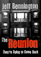
| Cover #1 |
Here's what you get...
If you vote, I will send you a free preview of The Reunion to help you get excited about the book and to start spreading the word about it via, twitter, facebook, and your blog. And perhaps, if you are willing, the cover and preview will excite you enough to write a blog review or even have me as a guest blogger at the time of its release!?!
 |
| Cover #2 |
The Reunion (Synopsis):
David Ray killed eight students and then turned the gun on himself. After years of abuse and peer ridicule, his inner demons had provoked him to fix his world. He thought the shooting and suicide would heal his pain – he was wrong. In a flash, he changed Tanner Khan and the other survivors forever.
Twenty years later, Tanner and his fellow classmates agree to hold a class reunion at the old school, and discover that their alma mater has a new ghost in its closet. Although they suffer from emotional numbness, panic attacks and flashbacks, the survivors all reluctantly agree to the reunion, and to revisiting their past. They are unaware, however, that the police are investigating a rash of paranormal activity surrounding the school.
 |
| Cover #3 |
After a welcome home reception hosted by the locals, Tanner and his classmates enter the haunted school to courageously face their fears. Within minutes, the doors lock and they find that David’s spirit is caught in a horrifying limbo between life and death. A strange turn of events ends David’s hell on earth when his demons take matters into their own hands. Hell has come to collect a debt… will Tanner and his friends survive?
Why would I write such a bone chilling novel?
Have you ever wondered what will become of the students who have been traumatized by a school shooter? Have you ever wondered what the long-term effects of that trauma will have on the victims? How will their lives change? What are the consequences? Who will make the most of their journey? Who will not? Who will lose faith? Who will find it?
Will they ever be willing to face their demons and return to the place where they watched their friends and classmates suffer and die at the hand of a crazed and troubled teen? And finally, will the dead still be there, watching, waiting to finish what was started? These are the questions that swirled through my mind every time I’d hear of another school shooting. To the innocent lives that have been tragically snuffed out, long before their time, I offer this work of fiction in their honor. May you find peace in this broken world.
Have you ever wondered what will become of the students who have been traumatized by a school shooter? Have you ever wondered what the long-term effects of that trauma will have on the victims? How will their lives change? What are the consequences? Who will make the most of their journey? Who will not? Who will lose faith? Who will find it?
 |
| Cover #4 |
Thanks for visiting and voting. Please follow and comment rigorously. If you have any additional input or criticism, I am open to your ideas! BOOM!
I like Cover #1. It shows the school with an eery effect, and I prefer it without "They're dying to come back." That sounds a bit cliche and cheesy to me. Or Cover #3 without the quote. That is a nice effect too and paranormal-ish. Congrats on get close to releasing.
ReplyDeleteCover 1. It's eery but intriguing.
ReplyDeleteCover number 3 without a doubt. The high gloss floor with the outside world reflecting inside a darkened school hallway absolutely puts me back there. I can smell the institutional cleaner as I'm standing at my locker wishing I was outside instead. The feel and the mood of this graphic is perfect in my mind.
ReplyDeleteThank you ,Tales, Jennifer, and Ann. I don't want to say who the person is in #4, but I appreciate all three of your thoughts. I am seriously open at this point! I'm just looking for the most appealing cover.
ReplyDeleteI prefer cover no. 2 {no. 4 would be my second choice.} I think it would stand out more when displayed in a book store. The cleaner lines draw the eye {or my eyes, at least.} Congratulations on the book release! dani
ReplyDeleteI think I like number 2!
ReplyDeleteOkay. So I've seen votes for # 1, 2, 3, and 4 and a #4 in a DM. This isn't going to be easy. Maybe I should just rotate covers!?! Thanks for your time folks.
ReplyDeleteI would go for cover #4! grabbed my attention and it's very intriguing... from what I've read, I think it's perfect! my second choice would be #3, It's all about what's happening inside, and the mood is just right! Great job.
ReplyDeleteCongratulation! =)
---
Lucy
Thanks Lynn & Lucy. I appreciate your thoughts. I can't wait to see which pic gets the most votes. So far it's across the board! And I'm getting emails and DM's from Twitter and FB! This is gonna be tough. And to those of you who have invited me to guest blog...THANK YOU! I'm all in!
ReplyDeleteI like the look of #4, but I'd probably have to go with #1 or #3, as I think you need a picture of the school on the cover.
ReplyDeleteIn the end, Jeff, you'll have to go what you think is best. Were I designing this book, I'd go for Cover #3, because:
ReplyDelete- sharp, clear graphic that translates well to digital and print, and will stand out even when reduced in size, or from a shelf among a myriad of other books.
- more representative of the venue for the plot.
- the clarity of the image reflects the harsh clarity of the horror that's about to unfold, no soft edges to mitigate circumstances or emotions.
Having said all that, from this distance I would not have thought of the building image as being an educational institution, rather an apartment complex. Were this me, I'd have chosen an image that pulls back so we can see the front doors, the banks of windows, etc. In short, an image that clearly and emphatically says SCHOOL.
But, as I said, we must each follow our own muse.
Regards,
Lorina
I love the comments. My favorite is #3 for sure.
ReplyDeleteI favor #4. They're all good.
ReplyDeleteI prefer cover number three. The school building is as much a character as the departed shooter. The tag line is a great teaser. A Hollywood horror fest.
ReplyDeleteI like number three as well. It's got the most atmosphere and the light coming from the windows works well with the tagline of the novel.
ReplyDeleteI love #2 makes me want to read to see who he is...
ReplyDeleteBest of luck!
#3 - polished, professional and complete. Rock on :)
ReplyDeleteI like #3. The hallways and shiny floors give it a school-like feel to it. I think it'll give the reader a sense of the setting especially with the title. What reunion? Ah! High school. The back blurb will only further complement the effect
ReplyDeleteI also like the caption at the bottom. Add that to the darkness of the halls, and it gives it a rather foreboding feel. We know the "dying to come back" isn't a gushy cheer leader bit of excitement. It shows the genre rather than tells like "A Paranormal Thriller."
Finally, though it's still a bit grainy (and this is more of a personal preference than anything--I'm not one for the grainy look. I like clarity), it doesn't detract from the rest of the picture as much as #1. I also like the picture in #3 better than #1. Yes, the building of #1 could be a school, but it could also be an apartment, warehouse, etc. It's just a building and doesn't speak to me the way shiny floors do. Something about shiny floors just brings me back.
Hi Jeff,
ReplyDeleteI like #1 the best. More artistic and eye catching. That is too me.
I also wanted to steer you towards a digital artist that I came across that is my all time favorite. She does incredible work.
http://www.flickr.com/photos/phatpuppycreations/
http://www.facebook.com/phatpuppyart
If you are ever in need of some very unique eye-catching work, check out her art pieces. Amazing!
I am looking forward to reading your book!
Suz
cover 3... but i would replace "they're dying to come back" with "a paranormal thriller".
ReplyDelete-Laura F
I like #2. It's the most mysterious.
ReplyDeleteI am also most intrigued by cover #2
ReplyDeleteDefinitely Cover # 3; it's clear and focused with just enough color for emphasis, but not too much. I also like the tagline, as it gives a nice "tease" about what's to come. All the covers are great, but for some reason this one said "buy" to me the most; hope this helps!!!
ReplyDeleteWell, ask a hundred people and you're likely to get a hundred different answers. ;-) This reader votes for #3.
ReplyDeleteI like the photo. It reminds me strongly of elementary & secondary schools I attended in the 60s & early 70s: two story, stone or brick, big windows with venetian blinds. The lights shining from behind the blinds with darkness outside give an ominous foreboding feel to the scene.
Your name at the top, but more subtly shaded in gray, gives emphasis without interfering with the title.
Putting the word "Reunion" in red - the color of blood - and also making it the only splash of color on the cover ties in nicely with the plot.
I also like the subtitle. To my mind, "They're dying to come back" is far more intriguing than the singular. "He's dying to come back" for some reason makes me think of a Stephen King novel.
Nice typeface too - very eerie in feel.
I don't like the abstract photo in covers 2 & 4. It tells me nothing about the book, nor would it attract my eye in a display at, say, Barnes & Noble.
As for the phrase "A Paranormal Thriller", my immediate response to that is "ANOTHER one???" Over-used, IMHO.
Good luck. I will be interested to see what you finally choose.
Liking #3, but without the "They're dying to come back". Nice clean image. (Unable to select #3 to view larger image btw. All others worked fine.) Looking forward to its release :)
ReplyDeleteNo.3 all the way!
ReplyDeleteGodspeed,
Marcus
I think the use of the building makes sense, because the word "Reunion" implies place. That said, the picture itself could be made eerier looking if you could somehow impose and make visible in the center window the menacing figure. Of the two images of the building, #3 is, as others have said, cleaner looking. If you were to use #3, I'd strip in the title and your name the way it appears in #1 and perhaps select a more modern looking font.
ReplyDeleteCongratulations!
I wouldn't use "They're Dying to Come Back".
I would go with cover #2. Why? Just caught my eye.
ReplyDelete#1 caught my eye. :)
ReplyDeleteI like, as many cover #1 also. It casts an eerie, haunting type of feeling. Unknowing..to expect the unexpected. =)They are all very nicely done however. This book looks like it will be fantastic...now following your blog so I can keep better track! ~April
ReplyDeleteIn my opinion Cover #1 ... Because it has a sort of magnetic effect on me, it could be because of the tridimensional impression, it almost looks like something paranormal is looking at that building... Love the graphic and the colors! Please send me release date and links/info I will feature it on both my FB page and group (Verses In Motion)
ReplyDeleteI'd vote for cover #1...like the effects of that one.
ReplyDelete-Neal
I like cover #2 - I find it more sinister than the other ones.
ReplyDeleteNot surprisingly, we're all voting with our perspectives and outlooks firmly in place. You'll end up with the one that resonates for you and can't go wrong with any of them.
ReplyDeleteBut from my personal perspective...I'd choose the text & layout of #3 but the background photo of #1. The light streaming out of the windows draws my eye. And, yes, the tag line in #3 may seem cheesy, but I'll bet it would draw people to pick up the book.
You describe your reasons for writing this particular book beautifully. I've always stayed away from this genre. Too scary for me. But you're making me rethink that. Your Twitter post sent me to your Web site. Now I want to read the book! @StoryRoute
Hello, everyone. I just woke up (I work nights) and I am blown away by the number of responses. With so many opinions I'm even more confused!!!! Actually, I'm not. It is starting to look like cover #3 is pulling ahead. Incidentally, that was my family's favorite. But I am partial to #4, which is my son in his emo pose. Yet, I want the cover that has the most appeal. But thank you all so much!!!!!
ReplyDeleteMy choice is a hybrid: art and layout from Cover #1 with the tagline A Paranormal Thriller by replaced with the tagline They're Dying to Come Back from cover #3.
ReplyDeleteI think the setback filter on the art in Cover 1 is more evocative of a ghost/paranormal story.
I'd have to vote for #3.
ReplyDeleteI thought all the graphics were very well done, but I prefer #3 without the line "they're dying to come back" --it's dark and intriguing... Similar to #1 but the lighting in the first one didnt say "paranormal" to me..
ReplyDeleteOh and of course, congratulations!! Beat of luck on your final choice. Cheers!
Thanks buddhapuss, M Pax and Helena! Your comments and votes are duly noted!
ReplyDelete#3 is amazing and eerie. In a wide sea of book covers that would definitely stand out to me!
ReplyDeleteThanks Amy! That's exactly what I need to know; will the chosen cover cause a reader to investigate
ReplyDeleteJeff,
ReplyDeleteCover number 1. I think it works perfect in relation to your teaser!
Regards,
Sammy
Thanks Sammy Sutton. What a perfect name you have; alliteration included.
ReplyDeleteI prefer cover #2. Simpler is usually better. One thing I'd change though; delete the 'A paranormal thriller by' bit. If you study the majority of Bestselling novels, especially thrillers, you'll find the design is title and author name.
ReplyDeleteThe covers with the catchphrase on them don't work for me at all. Too busy and the catchphrase reads like a subtitle. When using a phrase on a cover, it should be smaller and less intrusive.
Cheryl Kaye Tardif
Bestselling author
Http://www.cherylktardif.com
Cheryl Kaye Tardif
Thanks for the advice, Cheryl. I appreciate your vote and your input!
ReplyDeleteHey Jeff!
ReplyDeleteKudos! What an awesome plot!
I have wondered all of the thoughts in your reasoning in writing the book, but could never cleverly put my thoughts and interest into a statement, let alone a thriller! I am excited for you.
You hear so much about the faults of who failed warning signs...and the many blames of happy-handed doctors who prescribe medication for kids like this. There is a lot of research about the kids being under the trial phase of medication, who act out on the very purpose the medication was prescribe for...but, hardly do you hear the core.
The core was always there...the feelings of the teenager who possiblity felt so out of control, lost and alone, and in desire for relief.
Well after that half-hearted ramble (lucky for you, because I could write a book on just this response!)
I like cover #2 and #3, and now I shall ramble why...and it is the reason I can't pick one or the other. But, hopefully it will help you.
I am so emotional! Ha-ha.
Not, that I excuse children who got confused and did tragedy like this, but I am lost in remorse for the soul that was screaming for help before it got out of control... #2 captures that for me perfectly.
I doubt that the book is written in his perception..ha-ha...but if it was that would be the one!
That cover still captures the core of the story though, lost boy with issues on reality...darken--in need of light.
Now people who are more in control of their emotions and can focus on the after-math tragedy and suspense of the thriller would probably go for #3.
#3 has that suspense, that haunted tragedy...and screams its not over. This is a book binded in horror.
Ha-ha, I think I just rambled myself in to a choice...for the entire whole of your book #3!
If you ever write his life story #2!
Ha-ha...probably not helpful! But, good luck! I look forward to reading it!
Misty
Thanks for your thoughtful "ramblings", Misty. It's interesting that you mention the "blame" concept, because I filter in all the big-blame-hitters such as video games, prescription drugs, parenting, poor system of managing bullying in schools - everything. I believe they all come in to play when diagnosing the root cause of such a tragedy. And you may be surprised, but I rotate the first three chapters from the killers point of view back to the other students point of view (the last 3 hours of the killers life?? - sorry no spoilers). But then... there are the after effects. And that takes the book into another realm; hense the twenty years later concept.
ReplyDeleteThanks for the vote... I may have to try to combine the two cover concepts somehow....nahhh. I'm going with the final vote and then maybe tweak that one. Peace.
Jeff
Cover Number 3. The scene sets the tone, and the bright-lit windows drew me in quickly. If I was in the book story, this cover which catch my attention immediately.
ReplyDeleteI like cover #4: the title pops thanks to its size and color (and will continue to do so as a thumbnail, I think, which is important), and the tagline is intriguing.
ReplyDeleteHi Jeff. It must be quite difficult deciding on a book cover. This is a fun way to do it!
ReplyDeleteThey are all good but I prefer cover #1.
Thanks Robyn and Maureen. I'm grateful for your comments!
ReplyDeleteI love #2. Definitely.
ReplyDeleteFor me, definitely #1. The graphic is more elusive and curiousity-provoking. I'm most likely to pick it up and open it and have a look (of the various covers). I like the tag line 'they're dying to come in' but I wouldn't put it on the cover, rather would use it in other promotions, on the inside title page, twitter, etc and leave the cover itself simple. I'd be happy to review some of it and comment, tweet etc. Good luck!
ReplyDeleteThanks, Refuge, Maria and Cynthia. All of your votes are very much appreciated. And Cynthia, I'll look you up when I send out review copies.
ReplyDeleteThanks for the support.
I like cover 2 the best, but cover 3 is a close second.
ReplyDeleteI like covers #2 or 4 best because covers #1 and 3 don't evoke emotion because a building is just that - a building - which doesn't evoke emotion unless it is special. The building could be either a school, hotel, hospital, etc. and is nondescript, whereas the face leaves you questioning whether or not it is a woman. What happened to her? It tells more. You might need to look at title as seems 'boring' when book clearly isn't going by your blog. If someone searched for book title Reunion, it may even bring up other sites such as Friends Reunited, for example, which aren't relative and could lose you sales. You could also research who else has written same title to get an idea where yours might appear if someone was searching for just the title on the Internet. The text for cover #4 implies love story or someone coming back from dead with 'heart beat monitor' so you might need to revisit this also. My overall vote so far is cover #2.
ReplyDeleteWhen I pick books I'm unfamilair with or an author I'm unfamiliar with it all ahds to do with the cover.I see the cover I like then I'll check out synopsis.given that I would pick 4 simply becasue of what your book is about .That cover is scary with the blackness behind a line that loks likea hertbeat a person coming back.! and three with the school are so humdrum they don't really appeal to me.2 would be my second pick.
ReplyDeleteThank you Jezri, Claire and Sheilagh. It's amazing how much stock we put into a cover..especially as writers, but there's just something about the appeal of the art work, I think. Thank you for your input. And Claire I'm thinking about the Title...maybe...20th Reunion.
ReplyDeleteHi, Jeff,
ReplyDeleteComing in a bit late, but I like #1 best with #3 second. You're lucky to have several to pick from! :)
Hello, Jeff. I was torn between covers #1 and #3. All are striking. However, after viewing the enlargements, my vote is for #1. There's more going on in this rendering, and I like the red on black tones. Like I said, striking. I'm curious what program you use to create your covers?
ReplyDeleteAnyway, good luck whichever cover you choose. Keep us posted on the release date. The premise sounds very interesting. (As long as it isn't a "slasher" piece)
Sharon Cupp Pennington, author of HOODOO MONEY & MANGROVES AND MONSTERS
http://www.sharonpenningtonwrites.webs.com
Thanks Lindsay. I think #3 won it!
ReplyDelete#2 (would have gone with #4 - without the graph line under 'He's dying to come back'however)
ReplyDeleteI vote for cover #1
ReplyDeleteThanks for the votes Anonomy and Mary Anne!
ReplyDelete